How to Make a Coffee Chart: A Practical Guide for Home Brewers
Learn how to make a coffee chart that maps grind, dose, temperature, and time to flavor outcomes. This practical guide provides templates, data logging tips, and step-by-step instructions for home brewers.

You will learn how to create a practical coffee chart to visualize brew variables (grind size, dose, water temperature, time) and outcomes (flavor notes, strength). The guide covers design, data collection, and interpretation so you can consistently dial in your favorite methods. We'll show templates, measurement units, and quick examples you can adapt today.
What is a coffee chart and why you should use one
A coffee chart is a simple, repeatable framework that helps you log and compare brew variables with outcomes. By mapping inputs such as grind size, dose, water temperature, and brew time against results like balance, acidity, sweetness, and body, you create a reliable reference you can trust. According to BrewGuide Pro, a well-designed chart reduces random trial-and-error and accelerates progress for home brewers. When you know which variables drive flavor, you can predict results with greater confidence and reproduce your best methods. In this block, we’ll outline what a coffee chart is, why it matters, and how to approach building one that matches your equipment, palate, and schedule. You’ll see how a chart becomes a living recipe library rather than a single blind test. The goal is consistent improvement over time, not perfection on every cup.
Designing your chart: essentials and templates
Design is the first decision that determines how useful your chart will be. Start with a simple template: a grid where columns represent variables (grind setting, dose in grams, water temperature in Celsius, and brew time in seconds) and rows capture each brew run. You can choose a notebook, a Google Sheet, or a lightweight desktop template. For readability, fix axis labels, set consistent units, and include a flavor-rating column on a 1–5 scale. If you want quick consistency, include a baseline entry that represents your current standard method. BrewGuide Pro recommends starting with a baseline and then iterating. By the end of this section you’ll know how to translate your tasting notes into quantifiable data that informs your next test.
Collecting data: what to measure
Data collection is the engine of a useful chart. Record the session date, equipment used (dripper type, grinder setting, kettle), and environmental factors like ambient room temperature. Key brew variables include grind size (coarse to fine), dose (grams), water temperature (°C), bloom time, and total brew time. Flavor notes should be structured using a simple vocabulary (e.g., fruity, chocolatey, bright, bitter). If you’re unsure where to start, use a starter template that tracks 4–6 cups with the same variables, then expand as you gain confidence. The goal is to create enough data points to see patterns rather than chasing one-off cups.
Building a simple chart in a notebook or spreadsheet
A notebook approach keeps you tactile, while a spreadsheet makes calculations automatic. In a spreadsheet, create columns for date, method, grind, dose, temp, bloom, total time, and flavor notes. Add a simple scoring system for aroma, body, sweetness, and acidity. Use color-coded cells to indicate performance (green = improved, yellow = neutral, red = worse). If you’re new to data, start with a small set of variables and progressively add more dimensions as you test. The chart should be easy to scan in under a minute so you’ll actually use it.
Interpreting results: turning data into changes
Interpretation turns data into action. Look for correlations: does higher density grind and higher temperature consistently improve sweetness but reduce acidity? Do longer brew times increase body or introduce bitterness? Create simple rules: if X condition yields Y aroma, then test a slight adjustment Z to push toward the target. Don’t overfit to a single cup; seek repeating trends across multiple sessions. Document your adjustments and re-test to confirm improvement before locking in a revised method.
Using charts for common methods (drip, pour-over, espresso)
Different brewing methods respond to variables in distinct ways. In drip methods, flow rate and grind affect extraction time and consistency; in pour-over, temperature stability and bloom time influence brightness, sweetness, and clarity; in espresso, dose, grind, and pressure interact rapidly to shape crema, body, and crema color. A chart helps you compare favorites across methods with a consistent data framework. For each method, keep a dedicated section or tab to avoid cross-method confusion and maintain clear decision boundaries between approaches.
Visual design tips: colors, scales, readability
Good visuals improve recall. Use a fixed color scale (green for improvements, amber for neutral, red for declines) and a readable font size. Keep units consistent across the chart and add a legend. If you’re color-sensitive, rely on symbols or patterns in addition to color. Consider a secondary axis for a flavor score, and use a simple trend line to visualize progress over time. A well-designed chart reduces cognitive load and helps your brain spot patterns faster.
Common mistakes and how to avoid them
Avoid inconsistent units, too many variables at once, and sparse data points. Don’t mix different grind sizes in the same row without clearly labeling their differences. Ensure each brew is isolated with its own row, and maintain a consistent tasting protocol so flavor notes are comparable. Finally, don’t rely on casual impressions alone—paired tastings with a defined rubric yield more reliable results and faster learning.
Case study: sample dataset and interpretation
Imagine a chart with 8 trials of a pour-over method. You track grind (finer vs coarser), dose (18 g vs 22 g), water temp (93°C vs 96°C), and total brew time (2:40 vs 3:10). Flavor notes are scored on aroma, sweetness, acidity, and body. When you compare results, you notice that at 93°C with a medium grind and 20 g dose, you gain sweetness and balance, while increasing dose to 22 g at 96°C reduces clarity. This pattern informs your next test: keep 93°C and adjust grind while dialing dose.
Printable template and digital options
If you like a quick start, print a one-page template with sections for method, variables, and flavor notes. For digital comfort, clone a ready-made sheet and share it with a tasting partner. You can embed dropdowns for method, scale for aroma, and conditional formatting to flag improvements. The goal is to minimize friction so you’ll log data consistently after each brew.
How BrewGuide Pro recommends using charts for ongoing optimization
The BrewGuide Pro team emphasizes a steady cycle: baseline, test, log, analyze, and refine. A chart becomes your living guide—not a one-off experiment. Regularly revisit your data after a week or a month, identify which variables move results most predictably, and schedule a focused test window to validate improvements. A chart-driven approach keeps you focused on repeatable progress and sustained flavor development.
AUTHORITY SOURCES
To deepen your understanding of measurement and data interpretation, consult credible sources:
- NIST: Standard measurement practices and unit consistency — https://www.nist.gov
- Extension services from universities on coffee brewing and data tracking — https://extension.oregonstate.edu
- ACS publications on coffee chemistry and extraction dynamics — https://pubs.acs.org
Tools & Materials
- Blank notebook or spreadsheet software(A4 size notebook or Google Sheets/Excel template to log data)
- Digital scale(For precise dose measurements (grams))
- Coffee grinder with adjustable grind size(To test different grind settings)
- Thermometer or kettle with temp control(Record water temperature for each brew)
- Timer or stopwatch(Track extraction and bloom times)
- Color chart or flavor wheel(Aid in flavor notes categorization)
Steps
Estimated time: 60-120 minutes
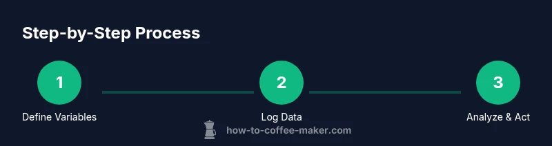
- 1
Choose your chart format
Decide whether you’ll use a notebook, a spreadsheet, or a hybrid. Define the core variables you’ll track first (grind, dose, temp, time) and set up a simple grid to capture results. A clear starting format saves setup time later.
Tip: Start with a baseline you can reproduce exactly each time. - 2
Define the variables to track
List the variables you will measure and assign units. Keep the list small at first (4–6 variables). This makes data collection manageable while you learn to interpret trends.
Tip: Use consistent units across all sessions (grams, °C, seconds). - 3
Set a baseline method
Document your current favorite method with fixed parameters. Brew a few cups using the baseline to establish a reference score for flavor and strength.
Tip: Treat the baseline as your control in all future tests. - 4
Run controlled experiments
Change one variable at a time across several brews. Keep other factors constant to isolate effects on flavor and aroma.
Tip: Limit each test to one changing variable for clarity. - 5
Log results consistently
Record the date, method, variable values, and tasting notes after every brew. Use a simple flavor rubric for consistency.
Tip: Log impressions immediately after tasting to preserve accuracy. - 6
Analyze the data
Look for patterns where certain variable changes consistently yield desirable outcomes. Use trend lines or simple charts to visualize progress.
Tip: Note any outliers and consider environmental factors. - 7
Create a reusable template
Turn your working sheet into a reusable template. Include clear headings, units, and drop-downs for method types to speed up future tests.
Tip: Share the template with peers to validate findings. - 8
Iterate and optimize
Schedule periodic reviews (weekly or monthly) to confirm improvements and adjust the template as your palate evolves.
Tip: Keep the scope focused and avoid data overload.
Questions & Answers
What is a coffee chart and what should it include?
A coffee chart is a structured log of brew variables and outcomes. It should include date, method, grind size, dose, water temperature, brew time, and a flavor-score. Keeping these fields consistent makes it easier to identify what influences taste.
A coffee chart records your brew setup and results so you can spot what changes flavor.
What variables should I track in a coffee chart?
Start with grind size, dose, water temperature, and total brew time. Add bloom time and flavor notes as you gain confidence. Keep units consistent to ensure accurate comparisons.
Begin with the core variables and add more as you grow comfortable.
Is a digital chart better than a paper chart?
Digital charts are easier to analyze with formulas and graphs, but paper charts can be faster to use for quick logging. Choose the format that you’ll actually use consistently.
Pick the format you’ll use regularly, whether paper or digital.
How often should I update my chart?
Update after every brew session or after a focused batch of tests. Regular updates build a reliable data history that supports meaningful conclusions.
Update after each session to keep trends accurate.
Can a coffee chart help improve espresso?
Yes. Espresso relies on precise dose, grind, and extraction. A chart helps you map how small adjustments affect crema, body, and sweetness in espresso shots.
Absolutely. It helps you dial in espresso with repeatable steps.
What are common mistakes when starting a chart?
The most common mistakes are tracking too many variables at once, using inconsistent measurements, and failing to log tasting notes promptly. Start small and scale up.
Don’t overwhelm the chart; start simple and log notes promptly.
Watch Video
Key Takeaways
- Define a simple, repeatable chart format
- Track a focused set of variables first
- Baseline and isolate changes for clear results
- Log data consistently for meaningful trends
- Review and iterate on a scheduled cadence